
Start with a color palette
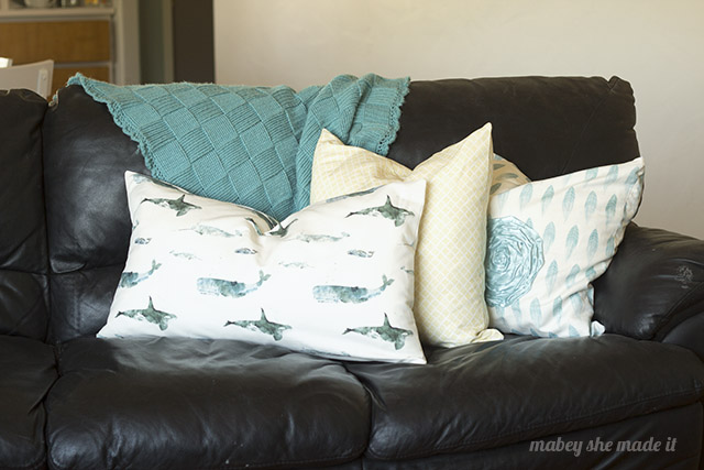
That color palette might start with a fabric you fall in love with. Or an art print. Or a rug. Whatever it starts with, keep that theme going. In my living area, I have aqua and yellow accents with gray walls and black furniture. I love the feeling that these lighter colors give the space, but I wanted to make sure it tied into the furniture as well. That’s why I chose the A Whale of a Time print–it’s got the aqua in there, but the watercolor effect gives a whole range of blues and grays that tie in everything in the space. And they’re stinkin’ cute.

Choose prints with different scales
Just like in quilting, when you combine fabrics, you want them to serve different purposes. They can’t all have a bold print or they’ll be competing. I love pulling in a solid color to keep things from competing normally, but this time I didn’t. Instead, I chose a yellow Basketweave print with a small-scale print that gives a nice overall color and still has lots of interest when you’re sitting next to it. The Painted Feathers have a medium-to-large scale, and while I typically wouldn’t have put two larger scales patterns together, this time it works because the feathers are a light color while the whales have more contrast, so your eye treats them differently.

Get a feel for them all together
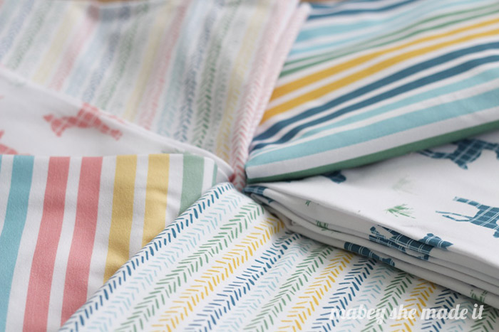
If you’re shopping online, put all the fabrics together in your cart, and visualize them together. Step back, and mentally treat them as one–do you see anything that seems off? If so, identify what’s sticking out and try a few different alternatives until they feel more cohesive.



I'd love to hear your thoughts–leave me a comment!