It’s been a long time coming, and I know many of you have asked for a post about our kitchen renovation, especially after I posted a photo on Instagram. And I’m coming through for you!

The past year (and a few months) have been so wonderful in our new home, and although the work is ongoing, the kitchen is one place that I just have to wander through from time to time to appreciate just how far it’s come. Because it’s come a LONG way.
Let’s start with a refresher, shall we?

Super dated (hello 80’s hunter green and burgundy wallpaper) with soffits, upper cabinets over the peninsula, and lots of honey oak. Also note the cute baby who is now more “boy” than “baby.”

And then there’s the half wall/stairway railing, the desk, and closets. It was time for a big renovation.
This space was one of the big selling points for this house, actually. In all our searching, we hadn’t found an older home with this type of open kitchen/dining room without major wall moving. We saved the wall moving for other areas. 😉
So what did we do? Within 24 hours of having the keys, we tore it to shreds. This video always makes me laugh–sometimes there are tears when our realtor friend starts laughing.
Watch with the sound on–it’s worth it!
Then we started putting it back together. First, we prepped for and had tile laid. We chose this beautiful 16″ x 24″ tile because I loved the linen look and also because the shape was a little different than anything else we’d seen. We laid it in 1/3 bricked formation for just a little twist. I love that it’s bigger without being TOO big, but isn’t the typical 12″ x 24″ tile.

I wrote about the changes to the electrical and plumbing in this post, so I’ll spare you the details again since they aren’t pretty. Next up, Chad built the cabinets (yep, he built them). It’s pretty amazing to have a custom kitchen with all the things you want–well, almost–there’s always that pesky budget. But I’m pretty lucky to have LOTS of drawer banks with dovetail drawers, a pull-out garbage, lazy susans, and a custom pantry too. Oh, and everything has full-extension slides and soft close hinges. It’s pretty amazing.


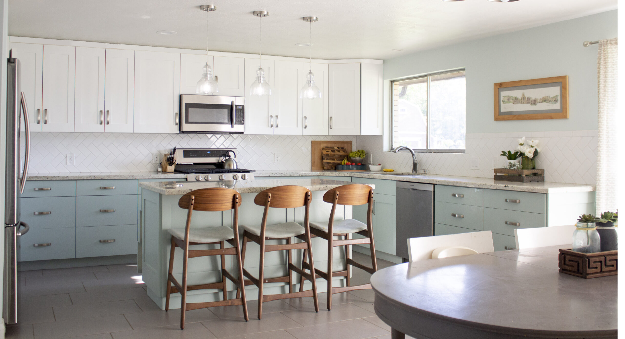
I chose a pretty minty aqua for the lower color. It felt like a big risk, since you don’t see aqua cabinets every day, but they’re so perfect. White uppers complete the two-tone look. We also chose shaker style doors with wider rails, flat drawers, and sleek brushed nickel pulls. They’re all so pretty and simple.

I wanted granite countertops again because I love being able to put hot pans wherever I want to, and this White was a great choice. I loved that it was subtle, but that it was light and that it had some aqua flecks in it.

For the backsplash, we laid the white subway tile in a herringbone pattern at a 45 degree angle–again, just a twist to keep it interesting. And I really love it.

When designing the kitchen, I wanted to keep everything simple and make it a calm and airy place to be. And I really committed to the aqua for that reason (it’s the main paint color for my whole house, and it felt like a bit of a risk–not many people use aqua as their neutral, but I’ve never regretted it).

A few other features include the cable railing that Chad built (which deserves its own post)

The vintage intercom that doesn’t currently work, but just had to stay. We plan to refurbish it–I’m a sucker for vintage touches.

and these beautiful pendant lights (I love seedy glass).

There’s just so much to love about this kitchen, and I’m so happy I get to share it with you. Taking the time to share photos has made me realize just how beautiful it really is (you know how when you see something every day it becomes “normal” and you forget? Yeah. I did that.).


So what do you think? Would you have chosen aqua cabinets, or did I go too far? What’s your favorite part? I’d love to hear in the comments. 😉



I'd love to hear your thoughts–leave me a comment!