Today we’re continuing our tour of our updated 1910 home we affectionately call Mabey Manor (you can read more about the original home and our other renovations on this page, or you can go to the girls’ room, master bedroom, and nursery posts directly). Today is the upstairs bathroom reveal. This room had so much work–it was really awful before!

When we moved in, Saige was three. She could kick the tub while she sat on the toilet. To say it was cramped was an understatement. And outdated big time–it always kind of creeped me out which was strange since I felt fine in the bathroom downstairs and it was just as bad. It rarely got used–we all went downstairs to use the bathroom except the kids during the night.


One of the biggest problems was that whoever renovated it last had built the tub into the middle of the room and created this strange closet behind it. So everything was squished in there and you had a 3′ wide closet that was pretty impractical because if you ever put something in the back of that closet, you’d never get it back out.

And who wants an unusable space over a comfortable bathroom?
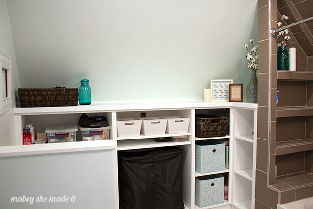
So our plan was to relocate the tub and remove the wall to open up the room and reconfigure everything. We’d take the storage space from unusable to shelving that would be both accessible and functional. There was plenty of space already there, it just needed some help.

We did push the wall back a little to pick up a couple feet of space which exposed a sloped ceiling, but it’s high enough that it doesn’t make you feel cramped or closed in.

Tile: (Affiliate links) Home Depot (both the 12 x 24 and the glass tile are no longer available online)
With the gross, in-the-way bathtub relocated to an existing wall, we decided to create shelves in the end wall for your toiletries and for a little decoration.

Cotton Stems from Decor Steals
The toilet is behind the half wall you can see from the doorway, and a new vanity replaced the existing in the same space. Chad built the vanity, the shelving in the room, and the mirror frame


Mirror: handmade || Granite: leftover from a previous project
We were able to use a piece of granite we had left over from a previous kitchen in this bathroom, and it’s perfect for the space. It’s a Bianco Antico granite, and I LOVE the bold pattern.

Paint: Behr’s Bakery Box on the Walls, Ultra Pure White shelves, vanity, trim, and mirror
There is so much usable storage in the bathroom now. It’s amazing how accessible everything is. You can walk around the bathroom without hitting into anything, it’s bright, open, and beautiful. I couldn’t love it more.


I'd love to hear your thoughts–leave me a comment!